It’s time to summarize plotting tools/methods so all is at command when is needed which will be a lot soon.
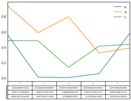
First, simple plot based on the below typical table

fig, ax = plt.subplots(1,1)
df = pd.DataFrame(np.random.rand(5, 3), columns=[‘a’, ‘b’, ‘c’])
ax.get_xaxis().set_visible(False) # Hide Ticks
df.plot(table=True, ax=ax)
There are bunch of graphs to choose depending on various situations
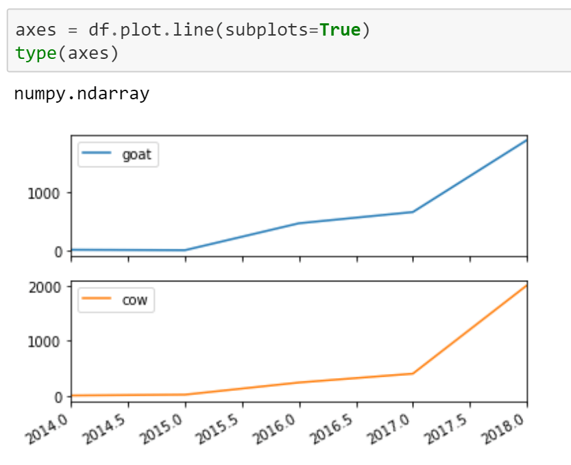
If we want to view the subplots, refer to
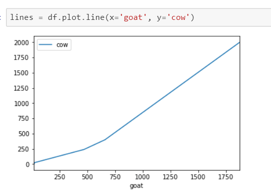
If we want to view two columns(series) be x and y axis respectively, refer to
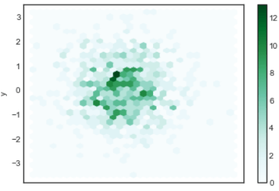
Or if we want to view in hexbin format
n = 1000
df = pd.DataFrame({‘x’: np.random.randn(n),
‘y’: np.random.randn(n)})
ax = df.plot.hexbin(x=’x’, y=’y’, gridsize=30)
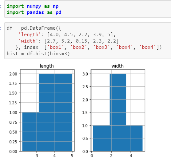
In data analysis, hist function is used a lot and is singled out in plotting too. The syntax of this method is
DataFrame.hist(data, column=None, by=None, grid=True, xlabelsize=None, xrot=None, ylabelsize=None, yrot=None, ax=None, sharex=False, sharey=False, figsize=None, layout=None, bins=10, **kwds)
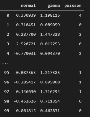
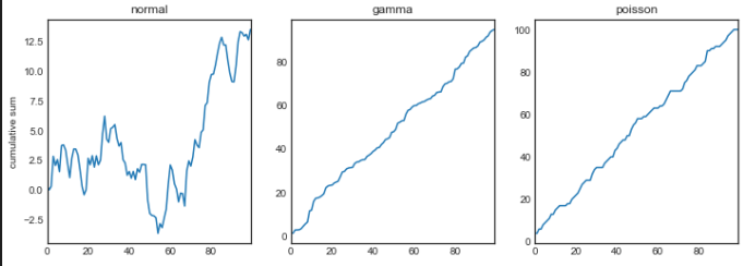
Now bringing it up a bit higher complexity
For example this variable is a dataframe by (
variables = pd.DataFrame({‘normal’: np.random.normal(size=100), ‘gamma’: np.random.gamma(1, size=100), ‘poisson’: np.random.poisson(size=100)}))
To outline each graph looking explicitly and controllingly
fig, axes = plt.subplots(nrows=1, ncols=3, figsize=(12, 4))
for i,var in enumerate([‘normal’,’gamma’,’poisson’]):
variables[var].cumsum(0).plot(ax=axes[i], title=var)
axes[0].set_ylabel(‘cumulative sum’)
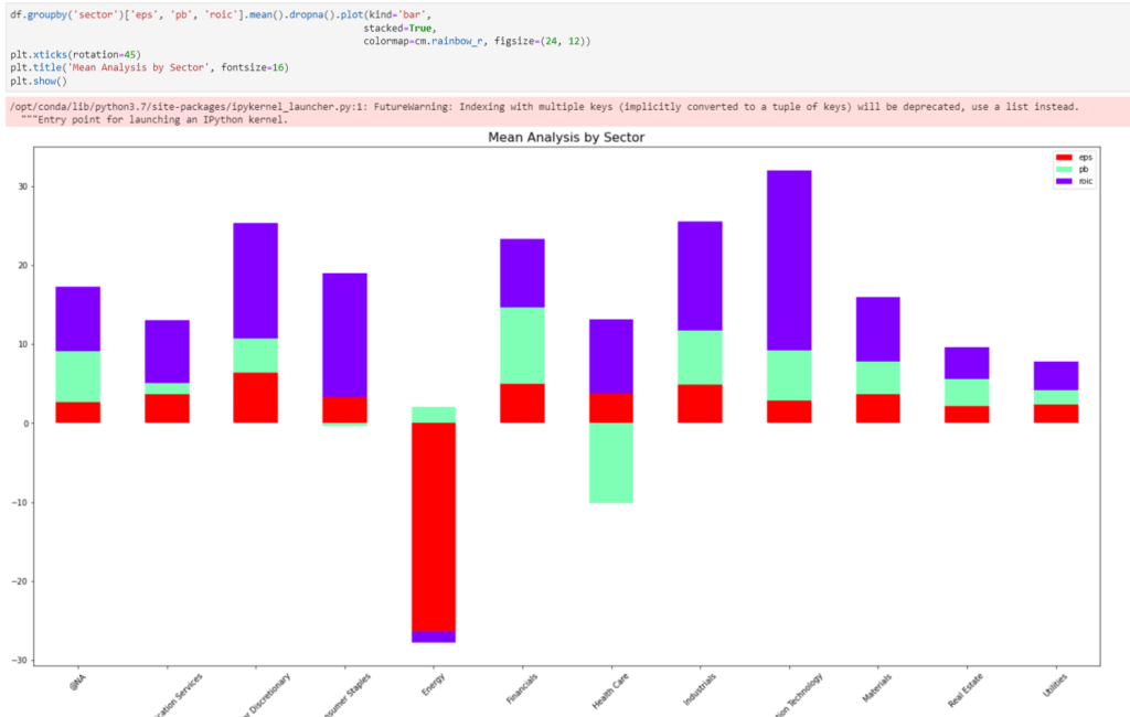
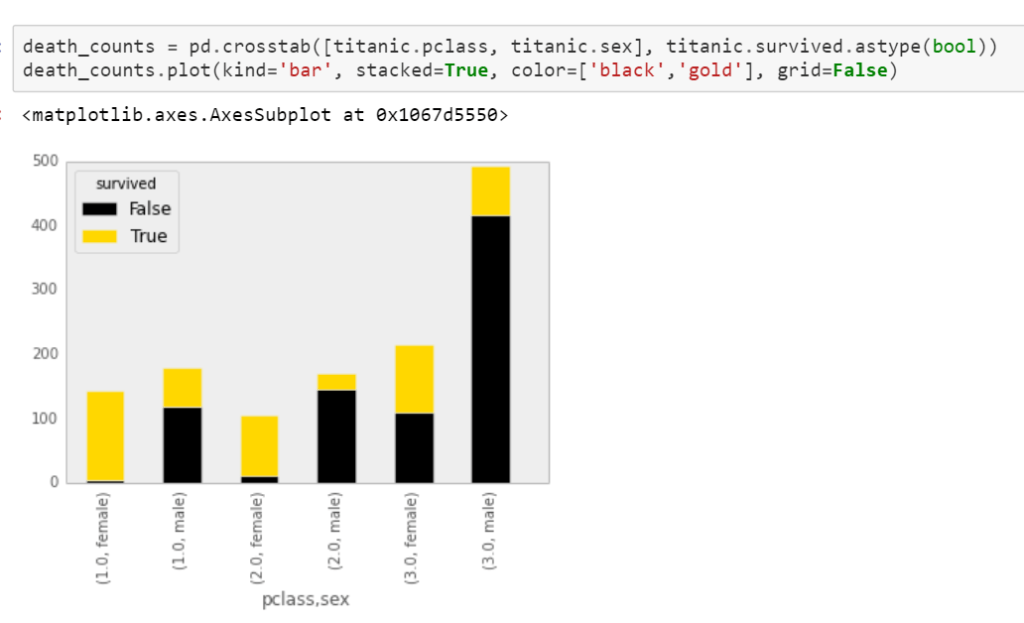
Also, we often need to plot a dataframe on grouping basis,

Or we can do fancy stacking (crosstab?)
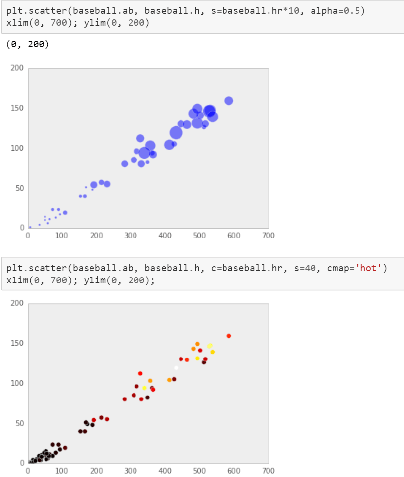
Scatter plot has bunch of parameters to play around note instead of df.plot.scatter(), one habitually use plt.scatter(df.x, df.y…)
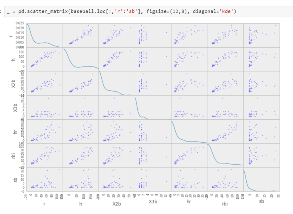
View large number of variable simutaneoulsey
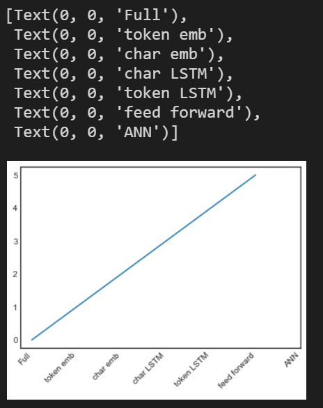
Thirdly, in daily work, often time we need to locate the parameter setting quickly, for example setting x axis label
#plotting
fontsize = 10
t = np.arange(0.0, 6.0, 1)
xticklabels = [‘Full’, ‘token emb’, ‘char emb’, ‘char LSTM’,
‘token LSTM’, ‘feed forward’,’ANN’]
fig = plt.figure(1)
ax = fig.add_subplot(111)
plt.plot(t, t)
plt.xticks(range(0, len(t) + 1))
ax.tick_params(axis=’both’, which=’major’, labelsize=fontsize)
# ax.set_xticklabels(xticklabels, rotation = 45)
ax.set_xticklabels(xticklabels, rotation = 45, ha=”right”)
Searching Mofan in modules.py gives lots of details.
Further, there is package of import bokeh.plotting as bp and in openquant sample snippets, they apply
import seaborn as sns
import missingno as msno
%matplotlib inline
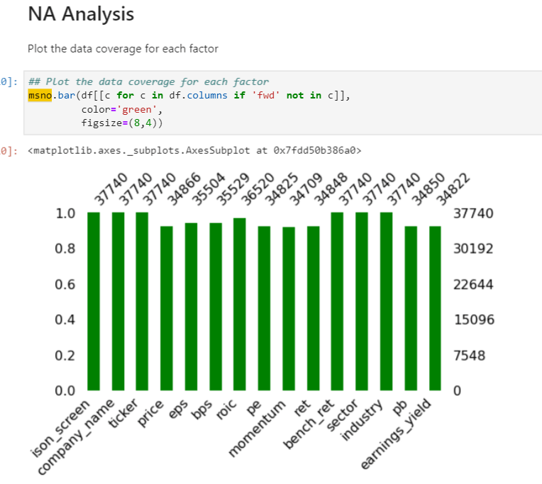
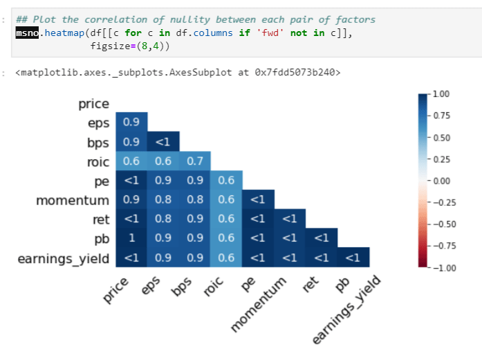
msno seems to be powerful in visualizing timeline features. Listing the following examples:
Heatmap to show the correlation of nullity, if one value is missing, the other highly probable to be missing too:
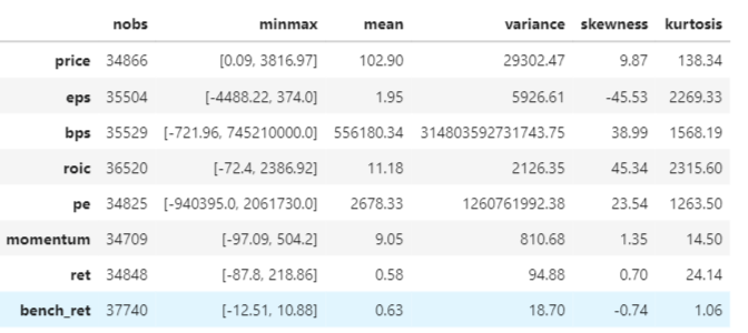
High level stats
advanced_describe = {}
stats_table = pd.DataFrame()
for factor in df.columns[3:11]:
advanced_describe[factor] = stats.describe(df[factor].dropna(), axis=0)
adv_stats = {keys: [np.round(series, 2) for series in values] for (keys, values) in zip(advanced_describe.keys(), advanced_describe.values())}
stats_table = pd.DataFrame(adv_stats, index=[‘nobs’, ‘minmax’, ‘mean’, ‘variance’, ‘skewness’, ‘kurtosis’]).T
stats_table
Based on the special format outlay, df=universe.data, they apply lineplot for time series visual, but it’s not applicable broadly though.

data is processed into two steps from

to this

Factor analysis like this
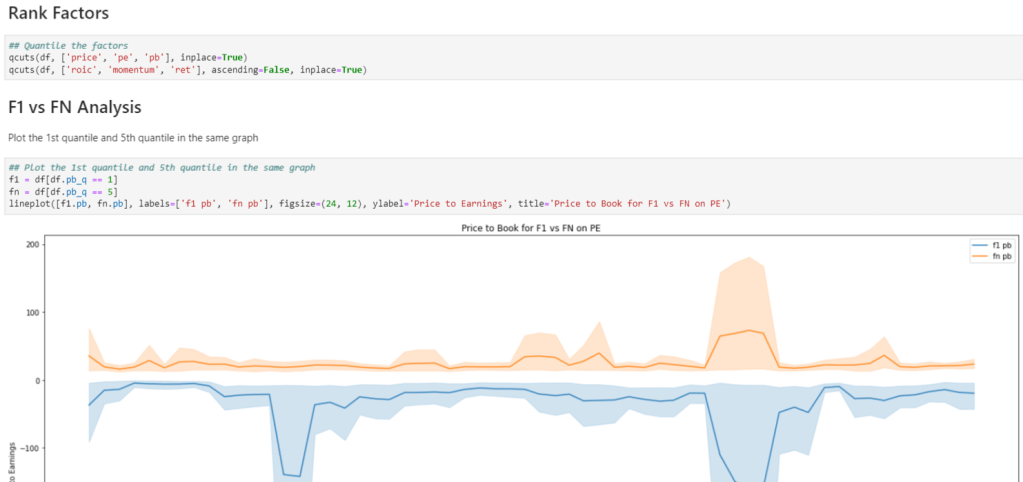
And group analysis on metrics such as pb: